orynn is a strongly-typed React UI library I designed, built and published on my own — a JSON-driven form engine wrapped in a shadcn-aligned component set of 71 accessible components, all sharing one semantic token layer.
It exists because of a pattern I kept hitting in enterprise work: every internal tool needs the same forty forms, and every team re-implements them by hand. orynn inverts that. You describe a form as a config object — fields, validation, conditional visibility, column layout — and the library renders it, validates it, and hands you the values back, fully typed.
Around that engine sits everything the rest of an app needs: dialogs, data tables, command palettes, date and colour pickers, toasts. One CSS file, one runtime dependency, ESM and CJS builds, and 573 tests keeping it honest across 53 releases.
$ npm i orynn
React ≥ 18 is the only required peer. One import for the stylesheet, one provider at the root, and nothing else to configure.
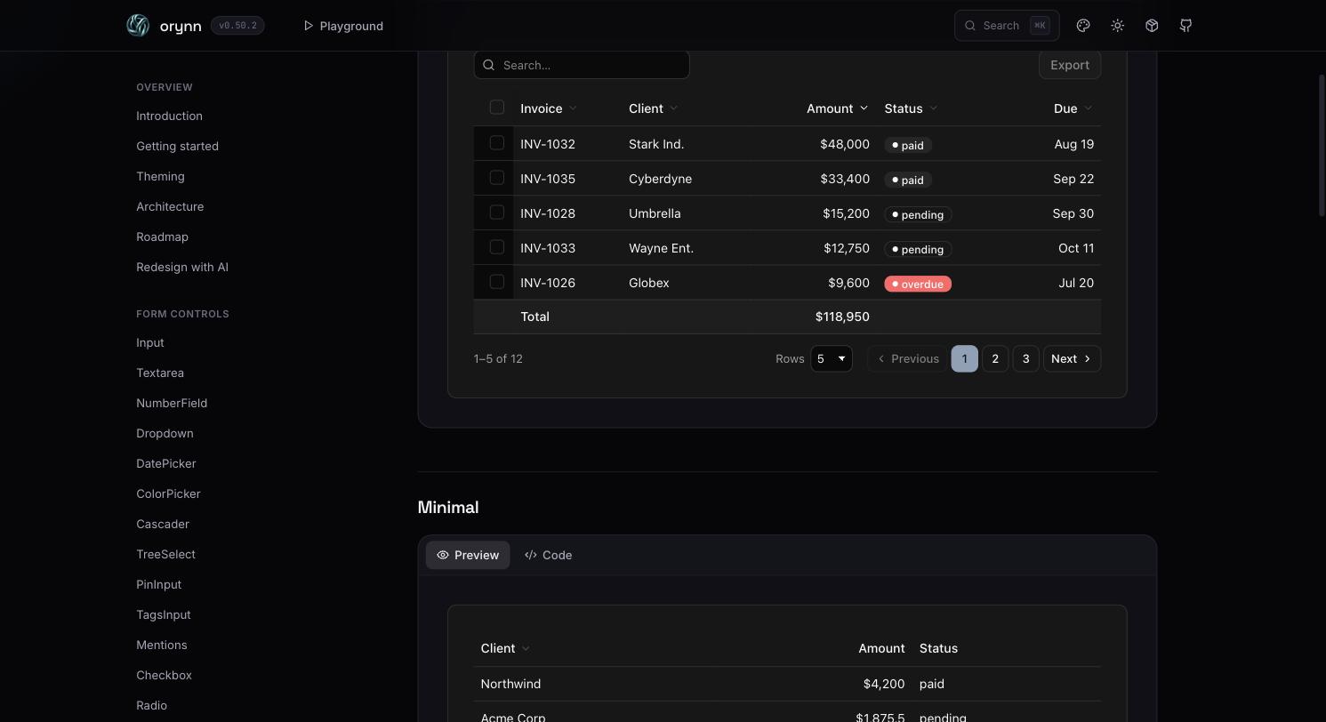
DataTable — sorting, selection, badges, totals, pagination and export, all driven by a single column config.
71
Components
573
Tests Passing
26.8K
Lines of Source
53
Releases Shipped
1
Runtime Dependency
One Config, One Form
The engine
A FieldsetConfig is a plain object — serialisable, storable, sendable from a backend. The type is a discriminated union on type, so a dropdown cannot compile without options and an unknown field type is a build error, not a runtime surprise.
when takes a declarative target ({ field, eq, in, truthy }) or a predicate over all values. Hidden fields stop validating — no phantom errors blocking a submit.
02
Pluggable validation
Built-in rules cover the common cases; anything implementing Standard Schema — Zod, Valibot, ArkType — drops in as a resolver without the library depending on any of them.
03
Fluid column layout
columns is a ceiling, not a fixed grid: fields reflow down to a minimum track width, with per-field spans overriding the fieldset when a control needs room.
04
Headless when you need it
useFieldsetState exposes the reducer behind the renderer, and a field registry lets you register your own control types against the same config schema.
Every component reads from the same semantic OKLCH tokens — background, foreground, muted, border, primary, ring. Presets recolour the primary and the focus ring only; backgrounds stay neutral, so a theme switch never turns an app into a colour wash.
OrynnProvider has no styling runtime at all. It resolves your config into --orynn-* custom properties and sets them. Your own className always wins over the library's.
default
Neutral, ships as the base
slate
Cooler greys
teal
The docs site default
violet
High-chroma action
rose
Warm accent
emerald
Confirmation-led UI
main.tsx
// The provider writes CSS variables. That is the entire styling runtime.
<OrynnProvider
  theme={{
    primary: "#4f46e5",      // any CSS colour — hex, oklch(), hsl()
    radius: "md",            // one knob; sm/md/lg/xl derive with calc()
    density: "comfortable",  // compact | comfortable | spacious
    colorScheme: "dark",     // also stamps the .dark class
  }}
>
  <App />
</OrynnProvider>
6 colour presets3 densities6 radius keywordsLight / dark by classCustom primary & ringFont & base sizeRaw var escape hatch
Hard Problems I Solved
Challenge 01
A Theme System That Doesn't Multiply the CSS
The Problem: The naive approach to presets is to fork the palette per theme. With 71 components and six presets, times light and dark, times three densities, the stylesheet and the surface area you have to test both explode.
My Solution: One semantic token layer in OKLCH that every component consumes, and presets that move only the primary and ring channels. Radius is a single --orynn-radius knob with the sm/md/lg/xl scale derived through calc(). When a consumer passes an arbitrary primary colour, the library parses its lightness — understanding hex, oklch() and hsl() — and derives a readable foreground automatically instead of asking them for one.
Challenge 02
Typing a Form That Doesn't Exist Until Runtime
The Problem: JSON-driven UI usually means giving up type safety. A config is data; the compiler has nothing to check against, so mistakes surface as a blank field in production.
My Solution:FieldConfig is a discriminated union keyed on the field type, so each variant carries exactly its own props — a dropdown without options fails to compile, an unregistered field type is rejected by the union, and switch narrowing works inside custom renderers. The rules are locked down with expect-type assertions that run as a compile-time test suite alongside the runtime one.
Challenge 03
Writing a QR Encoder That Actually Scans
The Problem: The QRCode component encodes from scratch rather than pulling in a dependency — and a QR code that renders is not the same as a QR code that decodes. Three bugs shipped before a phone camera caught them: the Reed–Solomon streaming division folded in the generator polynomial from the wrong index, alignment patterns whose centre sits on row 6 were being skipped by the timing pattern on version 7 and above, and the mask scorer was missing the 1:1:3:1:1 finder-like penalty rule.
My Solution: Fixed the generator index, reordered alignment ahead of timing, and implemented the missing penalty rule — then wrote a round-trip test that reads the matrix back with an independent decoder and asserts the error-correction syndromes come out clean. Regressions of that class can no longer reach a release.
Challenge 04
Publishing Dual ESM / CJS Without Breaking Consumers
The Problem: A library this size is judged on the install. Wrong exports maps, a single .d.ts served to both module systems, or a missing sideEffects hint and consumers get broken types, duplicate runtimes, or all 71 components in a bundle that imports one button.
My Solution: tsup emits a real dual build — index.js, index.cjs, and separate .d.ts / .d.cts — behind a conditional exports map with the stylesheet on its own subpath. sideEffects is narrowed to CSS so bundlers can tree-shake freely, and publint plus are-the-types-wrong gate every release, so packaging correctness is verified rather than assumed.
Ship it as a design system for humans and for the agents rewriting their UI.
AI tooling
orynn ships its own agent skill. One installer — npx @rajveer-singh-18/orynn-skill — detects the coding agent in a repo and drops the design-system rules where that agent looks for them: a skill package for Claude, a rule file for Cursor or Windsurf, an instructions file for Copilot.
The skill carries the token reference, the layout conventions and a redesign brief template, so an agent restyling an existing app maps markup onto real orynn components and tokens instead of inventing CSS. The docs site generates the brief for you.
Engineering & Packaging
Language
TypeScript 5.7 (strict), expect-type
Public types are a tested artefact, not a by-product
Runtime
React ≥ 18 (peer), radix-ui
The single dependency — focus traps, portals, ARIA wiring
Styling
Hand-authored CSS, semantic OKLCH tokens
One stylesheet, no CSS-in-JS, no consumer build step
Form engine
Custom reducer, field registry, condition resolver
Config → state → validation → render
Validation
Built-in rules + Standard Schema resolver
Zod / Valibot / ArkType plug in; none are dependencies
Build
tsup (esbuild), dual ESM + CJS, sourcemaps
index.js, index.cjs, .d.ts and .d.cts
Tests
Vitest, Testing Library, user-event, jsdom
573 tests across 86 files, including dark-mode coverage
Quality gates
Biome, publint, are-the-types-wrong
Lint, format and package correctness on every release
Distribution
npm — orynn, MIT, Changesets
53 tagged releases with a hand-written changelog
AI tooling
@rajveer-singh-18/orynn-skill
Agent-installable design-system rules for Claude, Cursor, Windsurf, Copilot