Rajveer Singh✕
Live Product · Cloudflare Pages

The Showcase
That Documents
Itself

orynn-web.pages.dev ↗84 pagesVite · React · Tailwind v4Built with orynn itself
Introduction

orynn-web is the showcase, documentation site and live laboratory for orynn, the React UI library I publish on npm. It is the front door to the package: the place where someone decides, in about fifteen seconds, whether the library is worth installing.

So it is built to earn that. Eighty-four pages of live demos, a complete prop reference, a drag-and-drop form builder, a theme lab that recolours the whole site in real time, and a command palette over every entry — all of it rendered with the library it documents, which makes the site its own most demanding integration test.

The long-form documentation is never copied here. It is imported as raw markdown directly from the library's repository at build time, so the docs cannot drift from the code they describe.

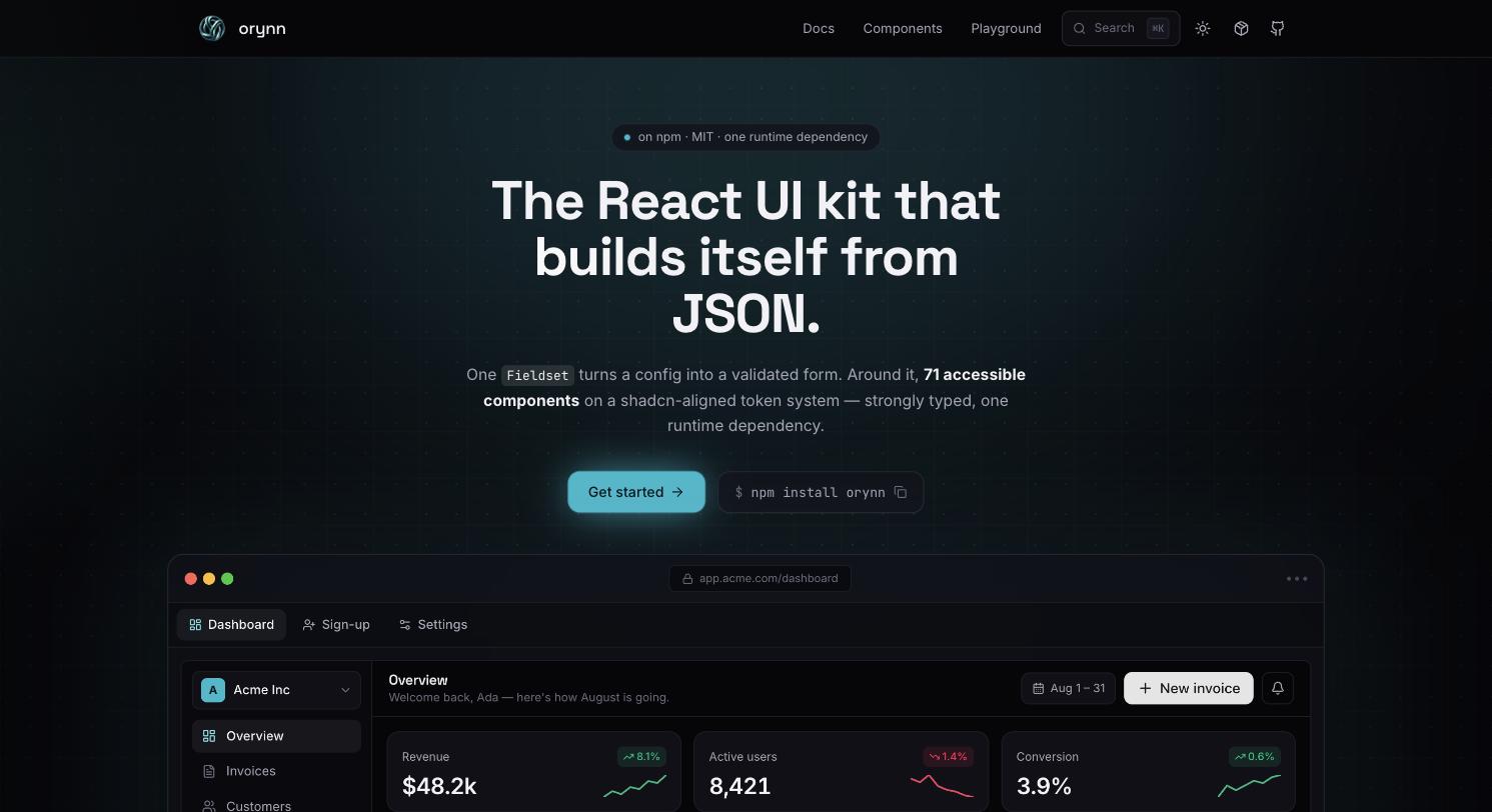
The orynn-web landing page — headline, install command and a live dashboard mock
The landing page. Everything below the fold is a working application built from the library — not an image of one.
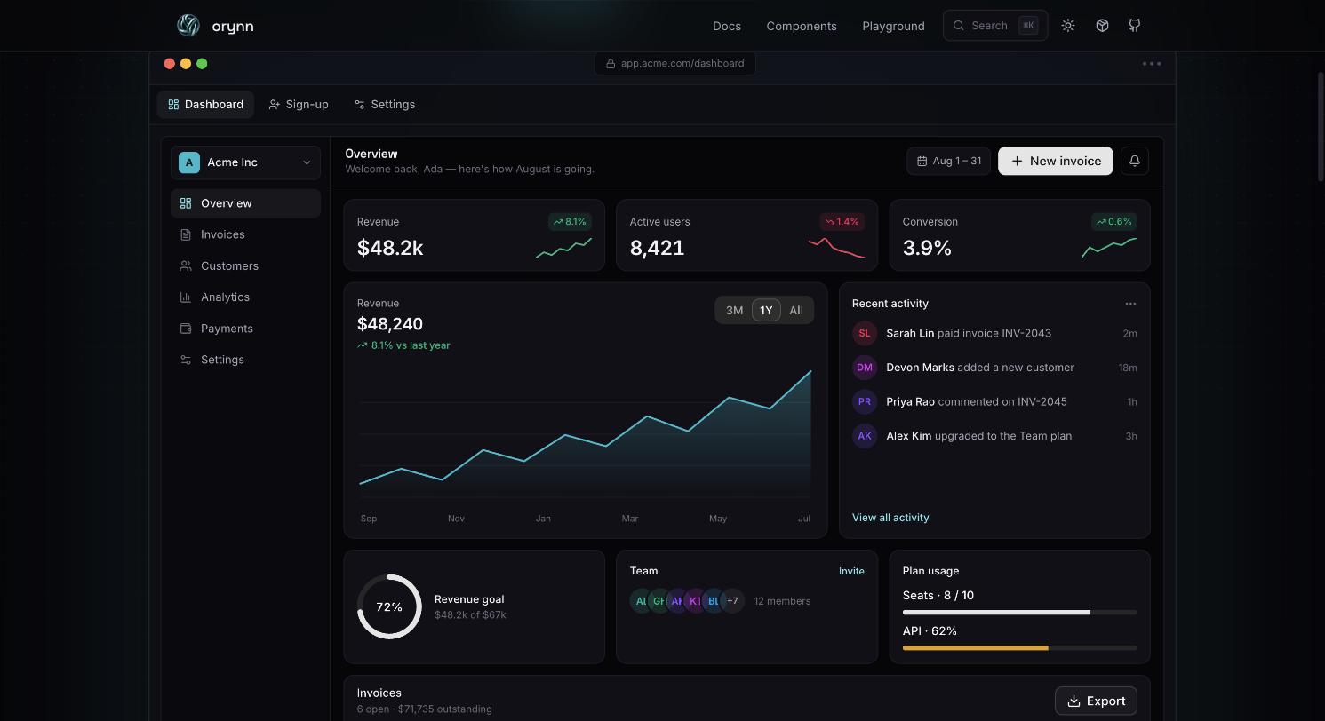
The dashboard mock — KPI tiles, revenue chart, activity feed and plan usage
Cards, stats, charts, avatars, progress, tables and badges — one token layer holding it all together.
84
Pages Shipped
71
Components Documented
19.6K
Lines of Source
0
Duplicated Docs
2.1MB
Static Build

What's On
The Site

01
The Landing Page
A full SaaS dashboard mock — sidebar, KPI tiles, revenue chart, activity feed, invoice table — assembled entirely from orynn components. The hero is the proof, not a screenshot of one.
02
Component Reference
One page per component. Every variant, every state, a Preview/Code toggle on each example, and a generated prop table with types and defaults underneath.
03
Form Playground
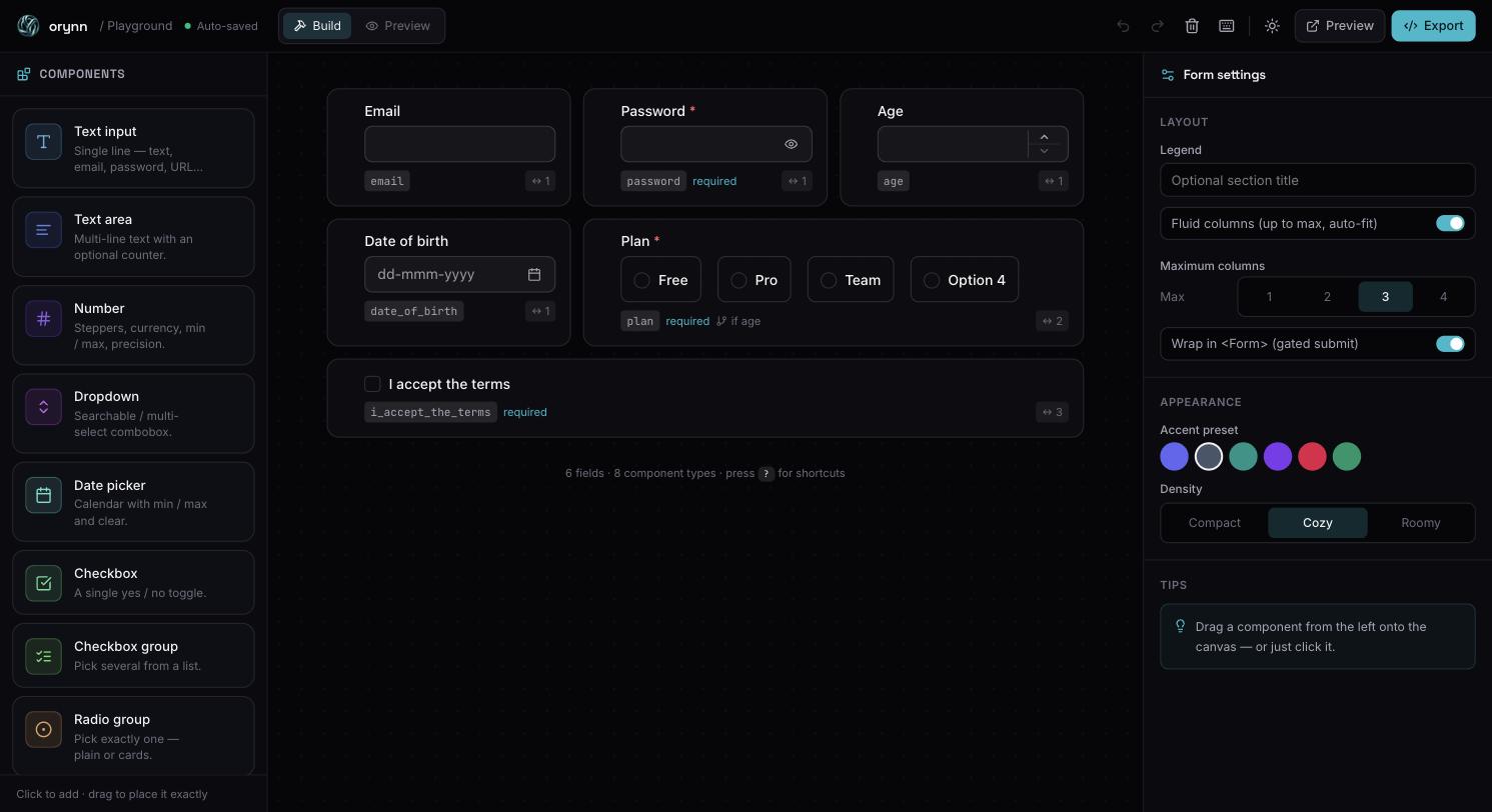
A drag-and-drop form builder: pick controls from a palette, reorder on the canvas, edit names, labels and validation in an inspector, and export a ready-to-paste FieldsetConfig.
04
Live Preview Window
The playground pops its form into a second browser window that syncs through storage events — desktop, tablet and mobile widths, light and dark, next to the editor rather than inside it.
05
Theme Lab
A floating panel that rewrites the same --orynn-* variables the library ships with. Change preset, density or radius and the entire documentation site recolours instantly.
06
Command Menu
⌘K opens a fuzzy jump-to across every page, component and guide — built with the library's own Command primitive, which is also how that component gets stress-tested.
07
Redesign with AI
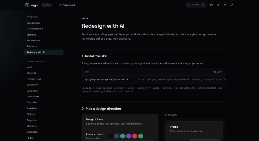
A guided page that generates an orynn redesign brief — primary colour, radius, density, scheme — as a markdown block you hand to a coding agent alongside the installable skill.
08
Long-Form Docs
Introduction, Getting started, Theming, Architecture, Roadmap and the changelog, all sourced as raw markdown from the library repo so documentation and code cannot drift apart.
09
Guides
Validation, JSON configuration, extensibility and accessibility — the conceptual material that prop tables can't carry, each with runnable examples.
10
Search & Navigation
A grouped sidebar across seventy-plus entries, prev/next pagination at the foot of every page, and a search trigger wired to the same index as the command menu.
11
Motion Layer
Scroll reveals, split-text headings, spotlight cards and a dot-grid backdrop — written to fail safe, so content is never left invisible if an observer misses.
12
Deploy Pipeline
Type-checked with tsc -b, bundled by Vite, shipped to Cloudflare Pages through Wrangler, with SPA fallbacks configured for Netlify and Vercel as well.
The playground — component palette, form canvas and settings inspector
Playground — palette, canvas, inspector. Auto-saved, undoable, exportable.
The Redesign with AI guide — install the skill, pick a design direction, live preview
Redesign with AI — pick a direction, get a brief, hand it to your coding agent.

Documentation
That Can't Drift

src/lib/docs.ts
// src/lib/docs.ts — the long-form docs are never copied into this repo.
// Vite inlines them at build time, straight from the library's own source.
import architecture from "../../../Library/ARCHITECTURE.md?raw";
import changelog    from "../../../Library/CHANGELOG.md?raw";
import theming      from "../../../Library/docs/theming.md?raw";
import validation   from "../../../Library/docs/validation.md?raw";

export const docs = { architecture, changelog, theming, validation };

// Rendered through react-markdown + remark-gfm + rehype-highlight,
// so a docs page cannot go stale without the library changing first.

Hard Problems
I Solved

Challenge 01

A Form Builder Inside a Form Library

The Problem: A JSON-driven form library is hard to sell with prose. People need to see a config become a form. But a builder is a real application — drag-and-drop ordering, selection, an inspector, undo, persistence — bolted onto a docs site that must still load fast.

My Solution: A dnd-kit sortable canvas over a small document model, with the whole document reduced through one state hook: add, duplicate, reorder, delete, undo and redo, auto-saved to storage on every change. The inspector edits field names, labels, validation rules and conditional visibility, and toConfig() serialises the document into exactly the FieldsetConfig a consumer would paste into their own codebase. Keyboard shortcuts throughout, with a ? overlay documenting them.

Challenge 02

Two Windows, One Document, No Server

The Problem: Previewing a form inside the builder means previewing it in a 600-pixel panel next to a palette and an inspector — which is nothing like the page it will actually live on. An iframe would have inherited the docs site's own theme and styles.

My Solution: The preview opens as a second browser window running the same app at a preview route. Both windows read and write one storage key, so edits in the builder propagate through storage events with no server, no socket and no shared bundle state. The preview window mounts its own provider, which is what lets it switch device width and colour scheme independently of the editor.

Challenge 03

Docs That Cannot Go Out of Date

The Problem: Every library with a separate docs site eventually lies. The architecture page describes a design that was refactored two releases ago, the changelog on the site trails the one in the repo, and nobody notices until an issue gets filed.

My Solution: The site owns no long-form prose. Architecture, roadmap, theming, validation, accessibility and the changelog are imported as raw markdown from the library repository and rendered through react-markdown with GFM tables and syntax highlighting. The package itself is consumed from the sibling repo, so the site builds against the same artefact npm serves — if a doc is wrong, the code is wrong.

Challenge 04

Retheming Eighty-Four Pages Without a Reload

The Problem: The strongest argument for the token system is watching it work. Screenshots of six presets prove nothing; a visitor has to change the primary colour and see every dialog, table and toast on the page follow.

My Solution: The Theme Lab writes into the same --orynn-* custom properties the library consumes, at the document root. Because the library has no styling runtime — the provider only sets variables — changing a preset, density or radius repaints every component on screen in one frame, with no remount, no reload, and no code path that exists solely for the demo.

The documentation site is the integration test.

Stack
& Delivery

Framework
React 18, TypeScript 5.7, Vite 6
SPA, strict types, instant HMR across 84 pages
Routing
React Router 7, lazy boundaries
Nested docs layout, error boundary, 404 route
Component layer
orynn (the library itself)
Dogfooded — every page is a live integration test
Styling
Tailwind CSS v4, orynn token layer
Site chrome in Tailwind, demos on library tokens
Builder
dnd-kit core / sortable / modifiers
Drag, reorder and drop-to-canvas in the playground
Editors
CodeMirror 6, One Dark, JSON language
Editable configs with real syntax support
Content
react-markdown, remark-gfm, rehype-highlight
Raw markdown imported from the library repository
Icons & motion
lucide-react, custom reveal / split-text / spotlight
Reduced-motion aware, fail-safe visibility
Quality
Biome, tsc -b project references
Lint, format and a type gate before every deploy
Delivery
Cloudflare Pages via Wrangler
Static output, SPA fallbacks for Netlify and Vercel

The Route
Map

//docs/introduction/docs/getting-started/docs/theming/docs/architecture/docs/roadmap/components/*/guides/validation/guides/json-config/guides/extensibility/guides/accessibility/playground/playground/preview/redesign
Role
Sole author — design, engineering, content, deploy
Author
Rajveer Singh
Documents
orynn — the React UI library, published on npm
Frontend
React 18, TypeScript, Vite 6, React Router 7
Styling
Tailwind CSS v4 + the orynn token layer
Interactive
dnd-kit, CodeMirror 6, lucide-react
Content
react-markdown, remark-gfm, rehype-highlight
Hosting
Cloudflare Pages (Wrangler)
Status
Live and maintained — 2026